 >For the latest cover, go here. https://bferrante.wordpress.com/2014/08/23/new-cover/
I’ve received a truck load of conflicting advice on my new Rumpelstiltskin cover.
What if Rumplestiltskin had a bum rap? Sure, he tried to take the queen’s baby, but a deal is a deal. Besides, he even gave her the opportunity to renege on their agreement. Plus, he never sought revenge, but allowed her to live happily ever after. Maybe there’s a whole lot more to his story than people know. A story about the importance of kindness. The elaborate illustrations are inspired by the illuminated manuscripts of medieval times. The reading level is third grade and up but younger children will enjoy hearing the dramatic, humorous, and touching story. A book for all ages. The story is followed by discussion questions for parents and teachers.
Which of these do you like best?
baby with flowers.
or
baby on flag.
or
Golden straw.
Fonts can be switched around.
Some people have suggested a fourth option. Both.
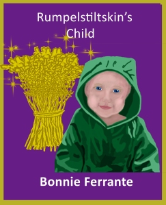
REMEMBER THE IMAGE HAS TO WORK AT ALL SIZES 8 x 10 AND 2 x 2 INCHES AND IN BETWEEN.
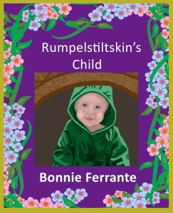
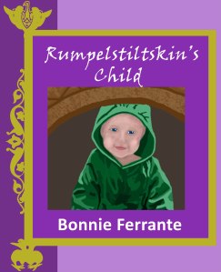
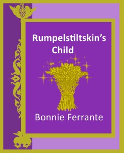
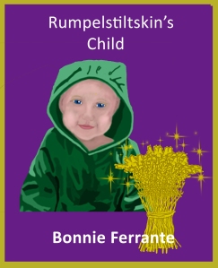
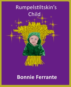
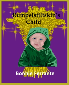
The 1st (blue) one.
LikeLike
Thanks Marianne.
LikeLike
Out of the three options, I like the Golden straw one.
LikeLike
Thank you for voting. 🙂
LikeLike
Are there any options? These look a little rough around the edges.
LikeLike
What do you suggest?
LikeLike
Good morning, Bonnie. Sorry, this got away from me yesterday. I think the cover just needs some more defined edges. Something a little more mature. It’s hard to put my finger on it. But thank you for your openness to feedback!
LikeLike
I’m a minimalist when it comes to book covers. I want to look at the cover & automatically see what its about. So, that’s why I don’t like the flower border one. I also think a child on the cover tells me what the book is about more than the golden straw.
LikeLike
The golden straw one
LikeLike
Thank you for taking the time to comment.
LikeLike
Of the three options available, I’d say number three–the straw. But the cover over there—–> on the side is actually one I enjoy better.
LikeLike
Which cover do you mean?
LikeLike
Hello – an opinion – the lettering on the pink one is not easily readable. The gold – the sheaf is not something a child would understand or relate to. It, however is not bad looking. I am sorry to say that I think the drawing – the faces on the children is amateurish. The one to the right of this post is better than any, but the elf or gnome is very primitive compared to the other figures. Sorry to be so unkind, but sometimes honesty is best.
LikeLike
I like the straw one best, with the blue one as a second choice
LikeLike
Thank you for taking the time to comment.
LikeLiked by 1 person
I really was not taken with any of the covers shown in my email from you. However, I like the basic child with straw much better than any of the others.
LikeLike
Thanks for your input.
LikeLike
The cover with both! 🙂
LikeLike
Thanks for taking the time to comment.
LikeLike
The flowery border design – no.
Rumpelstiltskin will mean nothing to most children today, so the lone baby, no.
The bundle of straw with the child Could attract a child’s attention, and were I the designer I would have made it less ‘gold’ and more straw in colour, and almost filling the cover with child centered in front of it. By enlarging the straw, more detail could be shown.
LikeLike
Thanks for your suggestions.
LikeLike
Originally I liked the one with the straw but now perhaps the one with the child and the straw in the foreground. Difficult choice.
LikeLike
Thanks for your help.
LikeLike
Golden straw
LikeLike
Thanks for coming by to vote.
LikeLike
#2 (baby on flag) for me.
LikeLike
I don’t think either of your images fit with the title very well. I prefer the gold surround and fancy writing for a fairy tale but think you need a better image for the centre. The baby image looks too modern and the straw image doesn’t link with the title. Sorry to be so negative, but you want an image that will appeal to children. What is the story about? Maybe work from that.
LikeLike
The story is about Rumpelstiltskin trying to get a child by spinning straw into gold.
LikeLike
I prefer the golden straw..simple and rich.
LikeLike
Thanks. I’ve taken all the criticisms and come up with this one. https://bferrante.wordpress.com/2014/08/23/new-cover/
LikeLike
HI Bonnie, for what it’s worth I am both an author and illustrator. Each of your covers has pros and cons. They all share similarities that I would like to comment on. The first thing I notice is that the art looks like it is set up on a template. Everything is even and linear. It has a computer generated look, which lack excitement and allure. The images are nice, but they are whispering when they could be shouting “Pick me. I’m a great story.” I think the overall design needs some tweaking. The background would be more effective if it related more to the image (2 ways to achieve this is through subject matter and by placement on the cover). You might want to consider using colors that “pop” or at least a couple of colors that brighten the entire image. Work to make the image a untied image of individual parts. Right now, for me, the individual parts don’t fit seamlessly together for a variety of reasons. Can you add some movement to the cover. Diagonal, wavy, zigzag lines, more contrast in color and shapes are ways to achieve this. Don’t give up, you have a good start.
LikeLiked by 1 person
Thank you, Janie, for taking the time to give such a helpful response. You shared a lot of information without being hurtful or tactless. It’s greatly appreciated. Did you look at the newest cover here? https://bferrante.wordpress.com/2014/08/23/new-cover/ I think it solves the straight line problem.
LikeLiked by 1 person